Advertising and Marketing
More than 50% of visitors to a website spend less than 15 seconds viewing it.
Consumer organisations rely on advertising and marketing to build brand awareness and promote their products. In a competitive market, the importance of attracting new customers is critical. Advertising is expensive and organisations need to catch the eye of the consumer as effectively as possible. This is typically done with images and colour is a major consideration.
There have been several attempts to classify consumer response to colours. However colour is so dependent on personal preference, culture and experiences, making it very difficult for organisations to develop a logo that is universally appealing.
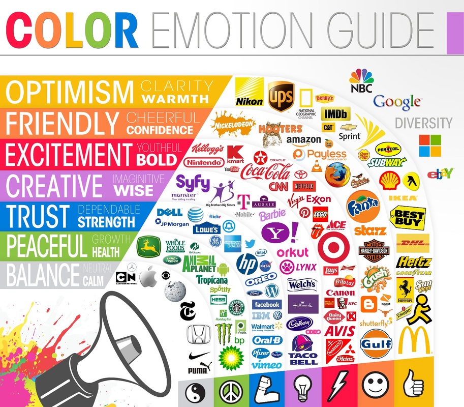
Generally, you will find that an organisation attempts to connect their logo to a psychological response using colour as can be seen below.
Consumer organisations rely on advertising and marketing to build brand awareness and promote their products. In a competitive market, the importance of attracting new customers is critical. Advertising is expensive and organisations need to catch the eye of the consumer as effectively as possible. This is typically done with images and colour is a major consideration.
There have been several attempts to classify consumer response to colours. However colour is so dependent on personal preference, culture and experiences, making it very difficult for organisations to develop a logo that is universally appealing.
Generally, you will find that an organisation attempts to connect their logo to a psychological response using colour as can be seen below.
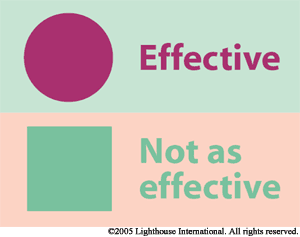
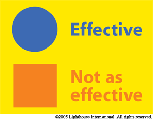
Colour and contrast is important.
|
|
We are inclined more to pay attention to a bright sign that uses contrast well rather than one that blends in with it's background.
In our media rich society, we are constantly exposed to images. What captures our attention, what doesn't? The psychology of photography has much to do with how we react to this media, and how much of it is retained in our unconscious mind.
